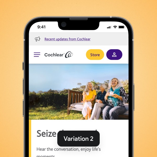
Challenge
On mobile, the navigation was placed at the bottom of the screen — a non-standard position that visually blended with the device UI. This made it easy to miss and limited users' ability to access key sections, ultimately affecting lead generation and eCommerce activity.
Results
By moving the navigation to the top of the screen and simplifying its structure, we made it more discoverable and intuitive. This change led to a +12.64% increase in mobile leads, a +20.32% boost in add-to-cart rate, and a +10.66% rise in form starts. The update confirmed that conventional UX patterns can have a measurable impact on user flow and performance.
*Project done at Conversion Kings.
12.64%
20.32%
10.66%