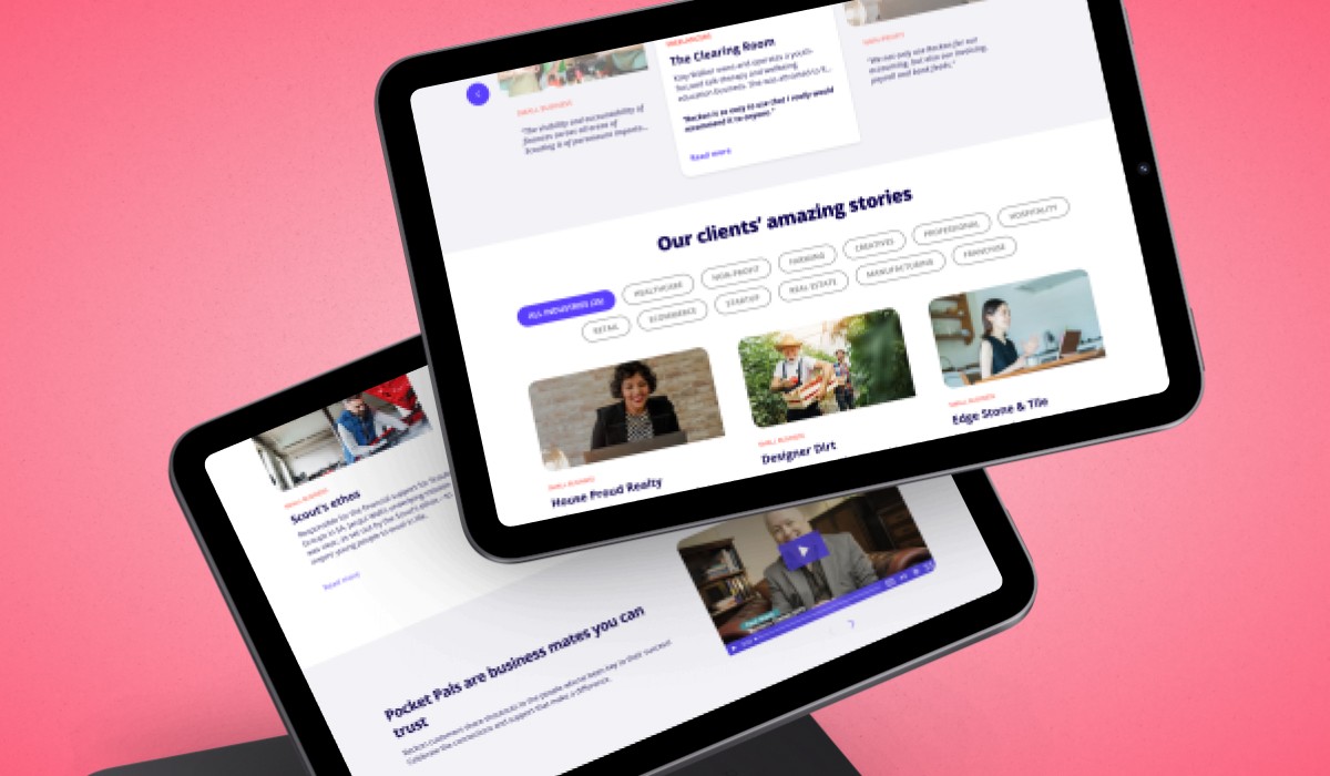

Challenge
The existing case study pages lacked structure and didn’t communicate the brand’s tone or credibility effectively. With limited hierarchy and no clear visual rhythm, users had trouble scanning the content or understanding its value — leading to missed opportunities for engagement and trust-building.
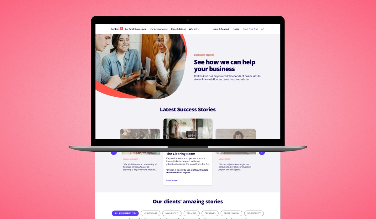
Results
I redesigned the case study templates with stronger visual hierarchy, consistent spacing, and branding that felt more aligned with Reckon’s voice. The updated design improved readability, brought focus to key outcomes, and supported users in understanding the impact of Reckon’s solutions — setting the foundation for better engagement and increased lead generation.
*Project done at Conversion Kings.
39%
22%
18%